
Monday, 3 May 2010

Sunday, 2 May 2010


Thursday, 4 March 2010
Feature article
A contagious sense of relaxation clouds over the dressing room of Isam Bachiri as he sits comfortably on a sofa reading a newspaper! (Is this our Isam? Reading?) …..Hmm, he certainly looks like our Isam as he is dressed and ready to perform at this years UK AM Awards, taking place in Central London. Sunday evening: after a day of relaxing, sleeping and eating lots of sweets, he is now dressed in blue skinny’s, a white kaftan top exposing a part of our favourite part of his body and his tattoo, his black leather boots, and a necklace he vows he will never take off, with a cheeky smile he looks up at me and states “I am ready to go”.
Isam, how did your music career kick off?
Well music has always been a big part of my life. Since I was a teenager I was taking guitar lessons, listening to lots of music, writing my own songs and I loved to take part in music competitions. It was only when I was in University studying Law that I realised that, actually this is not me; I needed something more exciting. I then won a musical talent competition with a prize of meeting my favourite Arab singer; Ihab Tawfiq and my meeting with him gave me a lot of inspiration and courage to go into the music industry and he offered me work to help out on his new single named ‘Upside Down’ and I took up his offer.
If you had not chosen the path of music, eventually, where do you think you would be today?
I have no idea, but I know I would have dropped out of Law no matter what. I just came to discover it was not my field. Where I would have been after that, only God knows the answer to.
Isam, you come from a Muslim faith and many people who belong to this faith have negative views towards music, how do you deal with these views?
The issue of music is a very controversial one in the Islamic faith and there are a number of varying views in this section. My own beliefs for this issue are that as long as your music aims to give some light to people, help them and enlighten them in some way then your music qualifies as serving its purpose. Music shouldn’t just be to sound good to people it is an aid to people’s lives.
Are your parents supportive of your music? How did they react to you dropping out of Law?
My parents have always just wanted me to do something in life that I enjoy and will allow me to live. As I realised that music was what I really wanted and Law was not, they were happy to back my decision and support me fully. My happiness has been the most important factor to them and up until this point I am very thankful to them and hope they are proud of me.
Isam the rebellious or good boy teenager?
(Laughs) That’s for me to know and you to never find out (Winks).
Come on, spill.
Ok, ok this is especially for my fans. I was always part of the rebellious crowd, but as well as keeping cool I would always make sure I kept up to date with my studies. My parents did have a difficult time with me in terms of my behaviour, but that’s every teenager isn’t it? (Cheeky smile). There were times when me and my friends would turn the classroom clock forward whenever we had a supply teacher so we would be let out of class early. Worked every time. One thing my parents never had to worry about were my studies.
What is the story behind the necklace you vow to never take off?
Sorry that story is off limits.
Can you at least give us a hint?
It links me someone very special who was in my life once.
Was? So I am presuming you're single?
Single I am!
What features do you look for in a girl?
Smart, sense of humour, beautiful smile, a good person and an appreciation for life as well as music.
You have a limited number of tracks that are actually based on relationships, where do you get the inspiration for your other tracks from?
All my inspirations for my music come from my experiences in life and other paths of life my life has crossed. I have travelled a lot to countries such as morocco, India and even Africa and have come across a lot of poverty, but you realise that although these problems exist there is a strong sense of love and community that exists. This is an example of what my song ‘What Lies Underneath’ is about. My inspirations also come from my favourite artists such as Outlandish and Ihab Tawfiq.
Apart from Arab music, what other types of music do you listen to?
I enjoy listening to hip-hop, Rock and some types of R and B music. But we all know that Arab music rocks!
How did your music change from your first ever album ‘Too late’ in 2005 to your first ever worldwide famous album ‘The Only Truth’ in 2007?
When I first started off my music career, I never really had a lot of life experiences, I mean I had just come out of a few months of university and did not go through a lot of difficulties in my younger years and so never really had a basis for my music. However, in 2006 I went through many difficulties and issues with my family and learnt many new things and these experiences gave me my inspiration and basis for my 2007 album.
What was your favourite song in the 2007 album?
It would definitely be ‘Looking On’ because this song derived from a very close and personal experience of mine which really touched my life and affected me in such a way that is has made me the person I am today.
We know you work solo, but would you consider doing work with another artist?
I would definitely consider it… it depends.
What happened to you last year? What did you get up to?
After going through a difficult time of watching my mum go through cancer, I observed of how lucky we were to be living in this country with so many opportunities and support. After this I always wanted to go out and actually help communities and people in difficult situations who were less fortunate than me and that’s what I did last year. I travelled down to Honduras in South America and actually got involved in a community project of building schools. Altogether it was a very emotional yet satisfying experience.
Are you currently working on anything new this year?
There definitely is something new, which I cannot talk about at the moment; however you can keep up to date with it on my official website. (Smiles).
Oh quick last question before you go and rock that stage! Favourite word?
Patience


Magazine Article Analysis


 NME
NME My Chemical Romance is an American rock band that NME have decided to set their feature article on. This is a popular band and a good choice for NME to base their feature article on for many reasons. The first being that NME are based on a wide range of Rock artists and this group fall into that category and therefore attract regular readers of the NME magazine. The second being that NME is based on a male dominated audience that are not teenagers but a little bit more in the mature age and My Chemical Romance is a group which used to be seen as a sort of teenage music group, however it is now moving on to become a more mature audience group and therefore appeals to the NME audience. In addition it is promoting and introducing My Chemical Romance to the more mature audience of the NME magazine.
The type of language used in this magazine article starts off to be quite formal and of a certain level of academic language. For example; it uses words such as baroque and surreal. These types of words appeal to a more mature audience rather than a younger audience who may not have even reached that level of academic studies. However as you go on to read the full article the language is very different and can be described as informal. For example it uses words such as Ha! It also uses quite informal language such as it says in the article, “Fuck it, we’re gonna pretend.” There are inappropriate words in this sentence as well as words such as ‘gonna’. These words are not exactly standard English or the queen’s language and therefore represents teenagers and the middle class as these are the people who are speak this kind of language and therefore are the target audience. In addition this type of language is seen to represent a cool image and is associated with rebels therefore representing the band in this way could be a technique to attract ‘cool’ people to the magazine.
The style of the magazine article does match the front cover and theme of the magazine a bit but not really. The colours used on the front cover are very NME promoting based as in the theme and colours of the front cover are based more on the company and magazine of NME. Whereas the colours green, white and black are used in the magazine article on My Chemical Romance and represent the band rather than the magazine. The parts that are consistent from the magazine front cover are the use of bold fonts and the style of font which is used. This style allows the audience to get attracted and keep a level of consistency and recognition of the style of magazine as the reader does not like complete change of style.
The magazine article has a tone that sounds as if the person is a well informed fan who knows all the specifics on the band. The article is solely based on My Chemical Romance’ s music and the stages and feeling that they went through whilst making their new record and therefore give answers that are based entirely on their fans. The tone can be shown to be a well informed fan as the interviewer says “line in blustery opener ‘Save Yourself’: “This ain’t a room full of suicides”, which is a line from one of their songs. You can tell that the tone is not of a close friend sort of tone as if this was the case there would be evidence in the article of answers from the interview where the member of the band would give more personal answers alongside which is not in the article.
The article is written in column form with pictures to accompany it. The writing takes up around three quarters of the page with images taking up about a quarter of the page. However the article starts off with a sort of front cover with a large A4 sized image of who the article is based on with a couple of lines of text. In this case a picture of My Chemical Romance. The next page on the article then moves onto a paragraph of introducing the article with no images but simply text alone. This shows that the article is based on an audience that are more into reading about the band rather than looking at a lot of pictures of them. It seems as if the article is aimed at more of an intellectual audience as it is based on a very long piece of writing, however the type of informal language contradicts this.
The article although advertised as a My Chemical Romance based article is actually focused on one member of this band and as are the pictures that accompany the writing. There are three images of the focused member of the My Chemical Romance band. Out of the three images two are in colour and the third which is a strip is in black and white. The coloured images represent the band as being quite modern and support the bands movement of coming out of its teenage viewed era. The use of the black and white image represents leaving their teenage era behind and bringing their band into a more mature outlook. The large main image is of the focused member in a photo booth about to come out and the strip images are of different parts of this members face. These images seem to promote this members appearance to the audience. The last image is of the member performing live which seems to promote his musical talent to the audience.
I believe that knowledge is needed on at least the previous records My Chemical Romance has created other than this nothing more is needed to be known. This is because the article is based on promoting the bands new record and explaining the differences between their assumed to be failed records in the past and to fully understand the article and the differences stated between pervious records and the new ones an experience of the past records is needed. In addition the article also refers to a lot of different songs, e.g. ‘Bullet Proof Heart’, along with views on these particular songs and of the songs have not been heard by the audience before then it will be difficult for the reader to understand the view stated on that particular song.
Q
Cheryl Cole is a British pop singer that Q have decided to base their feature article on. This is a good choice for their magazine for many reasons. The first reason being that Cheryl Cole is a pop singer and therefore as this magazine is based on pop music as well as rock music she fits into the music genre of this magazine. Another reason is that the readers of the Q magazine are of a more mature audience and Cheryl Cole is a popular choice and well known to the British audience of all ages. Therefore attracting readers that are not only the regular readers of this magazine but also other age ranges as she is popular amongst the young and the old.
The language used throughout this article is very informal, simple and easy to read. For example; “How groovy,”. This type of language although informal are words that are best related to a mature audience and simple language that is used such as; “amid allegations.” This type of language appeals to a wide audience that are both educated and less educated people as it can be understood by nearly all age ranges. This attracts a very wide audience and expands the readership age for this magazine.
The style of the magazine article matches the house style and the theme of the magazine front cover. The colours used on the front cover are white, black and red which are also used in the feature article. The use of bold, italics and the font are consistent and carried through into the article which allows the magazine to stay consistent. It also is a method of promoting the Q magazine and allowing recognition of the game.
The tone of the magazine article sounds as if the person is a close friend of Cheryl Cole. The article story narrator who knows all aspects and angles and feelings of the people involved. For example; “Cheryl Cole is sick to death of looking at herself.” This seems as if the person knows Cheryl Cole really well to know exactly how she’s feeling.
The article is written in a typical column form and has pictures to accompany it. The article starts off with a whole page taken up of an image of Cheryl Cole and then moves into an introductory page which consist of a large image with little text introducing the main article. The next four pages are of the main body of the article accompanied with images which take up large sections of the pages that consist of the main article. This shows that the article is based on an audience that are again very simplistic and are not very much interested in reading a lot, but rather looking at pictures o f their favourite artists.
All images in this magazine article are of Cheryl Cole alone continuing her ‘bad girl’ image in the rain. These images support the article which based upon her saying she doesn’t know what she looks like anymore which refers to her feeling a bit lost. Cheryl Cole is not really seen as a bad girl and therefore the image refers to her feeling like she’s not herself anymore.
No background knowledge of Cheryl Cole or her music is needed when reading this article. This is because the article states all facts and information that the article is talking about. For example the article says; “Her debut single, Fight For This Love.” This shows that the article states all relevant information as it could have just said ‘her debut single’ and not stated the name of that single and simply expected the reader to know what it was. This shows that no relevant information or knowledge is needed to be known before reading this article on Cheryl Cole.
Monday, 8 February 2010
My magazine title


Sunday, 7 February 2010
Analysis of contents page
 The contents page does not consist of the NME logo anywhere on the page, however the house style of the colours and fonts replaces the logo and allows the reader to identify NME.
The contents page of NME is set out with a central image of a band their one of their main focuses is on. This image takes up three quarters of the page which shows the importance of it and is supported by a mini article underneath it explaining the image. It is the first feature of the page that is recognised by an audience when looked at. The image consists of a band but also shows a lot of the background and the red carpet they are standing on which is very important to the point of the band. This part of the page which is the mini article and image is featured in a newspaper style with the image being explained and the date of the image taken stated. The shows the magazine is based on keeping it’s readers up to date on the activities their favourite bands are carrying out at present as the band Blur as featured are creating a new film. This central image and mini article taking up most of the page allows the audience to go straight to it and read it which then leads them onto wanting to read more and finally attracts them to look to the page numbers and titles to find the article to read. The different parts that the magazine features and the page numbers take up a long but small section in the left hand corner of the page with very a very small font size. This layout shows me that the audience of the magazine find the contents page of very little importance as they are regular readers they should know their way around the magazine just as they should know what NME stands for on the front cover, however it is there for extra support in case of need.
The colours and fonts that are used on this page are the same as those that are used on the front cover. Both bold and regular texts of different sizes are used and colours that are red, black and white are used. All of these features contribute towards building a house style for NME as these are the main colours of their logo and also supports the front cover of this NME issue.
At the bottom of the page a small section is based on promoting the NME magazine through offering a subscription deal. This will encourage regular buyers of the NME magazine to save money on their purchases and will secure purchases for NME with their customers.
Saturday, 6 February 2010
Results from my questionnaire
I handed my questionnaire to ten people from my target market and put my results in graphs as shown below:


My results from my questionnaire showed many things which will help me to create my music magazine. Majority people read magazines than those who do not read magazines which indicate to me that there will be a lot of people who will be interested in picking up a magazine which could be mine. Those people who did not read magazines gave reasons such as they do not have enough money to purchase magazines and that they think it is a waste of time when they can use the internet for all these items that appear in magazines. This tells me that my magazine cover should be of such that it would encourage people like this to want to and have to pick up the magazine and that I will need to come up with something original to attract these people. Most people who filled out the questionnaire purchased magazines on a monthly basis which I believe is because these are students who have a limited amount of money and cannot afford to buy magazines more often. This is the reason that my magazine will be a monthly issue my target market are between the ages of 16 to 21 and are students who do not have financially stable jobs. People within my target market who currently purchase magazines are also interested in magazines such as.
When asked what the maximum amount of money that was willing to be paid for a magazine most people said that they were willing to pay maximum up to £3. This is why my magazine will be priced at £2.20 so that my target market can afford to purchase the magazine. In addition the magazines that my target market currently purchase are priced around this price.
My results from my questionnaire show that 40% said that they would subscribe to a magazine, whereas 60% would not subscribe. Although this result was negative to the option of subscription for my magazine. I have still decided to offer subscription for my magazine through creating an original deal for my customers. I believe that this will be a good deal for my customers who can save a large amount of money through subscription and so making it cheaper for them. 70% of my target market who filled out my questionnaire said that they had in the past purchased a magazine due to a free gift. This indicated to me that I should ensure that my magazine should include free gifts. Furthermore, from the people who filled out my questionnaire 30% said that they would prefer the free gift of a CD rather than a poster. This is why my very first issue will include a free CD which will help me to draw customers to my magazine. Other free gifts that they received and chose to purchase a magazine were things such as free stickers, a yoyo, bubbles and posters. These give me a brief idea of the type of free gifts that my target market will appreciate.
I then asked my target market whether or not they had ever entered any competitions related to music where 50% had answered yes and the rest no. From this I concluded that I will be offering competitions related to my magazine and music with prizes such as free concert tickets. This appeals to my target market as they are the type of enjoy having fun with friends and going out. This will also encourage my target market to visit the website for my magazine as they would have to access it to enter the competition which will help the promotion of my magazine.
The part of a music magazine that was voted first choice from the results of my questionnaire was interviews with music stars. The features that were voted second were music reviews, gossip on stars and trends on music stars. From this I have decided to have a picture of the music star that my magazine will have a special interview with. I will then ensure that my front cover will inform my target audience of items inside the magazine which will be music reviews, gossip on stars and trends on music stars.
Lastly I asked my target audience which colours they preferred with purple, turquoise green, orange and hot pink coming up as first choice. So I have decided to use the colour turquoise green as part of the theme for my magazine. This colour will contribute to the title block, fonts and images on my front cover.
Thursday, 4 February 2010
Proposal and Questionnaire
Proposal
I will be creating a music magazine based on the genre of Arabic music. My magazine will be for females aged between 16 to 21 that live in the UK. These potential customers are interested in Arabic music as well as other types of music such as R and B. These females have a mature attitude but also have a side that is clinging onto their teenage years. They are taking their life seriously in terms of their work and education but are still enjoying their teenage years by just hanging with their friends. My potential customers are not only those who understand Arabic music but also those may not understand it but enjoy the sound of it. They are young females that like to feel good through the way they look, their friends and through the music they listen to. These females are not typical teenagers that are interested in finding boyfriends but just enjoy spending time with their friends whether that’s through shopping or going to a restaurant. They like to be presentable through the clothes they wear and pay special attention to their clothes. These females have phones with the latest music technology and not only like to be up to date with the latest music but also do not want to forget about classic tunes.
Currently in the UK there is no music magazine based on Arabic music and over the years Arabic music has become extremely popular through the younger generation as in teenagers. This is because the Arabic culture over the years has been having a great influence into the lives of the British teenage culture which started through the trend of shisha bars and belly dancing. There is a great interest in Arabic music and not just through people who understand Arabic but also through people who do not understand it.
Questionnaire for my music magazine
Please complete this questionnaire ticking the boxes where appropriate and filling in information where appropriate.
Do you currently purchase any magazines?
Yes No
If not then please state the reasons why
…………………………………………………………………………………………………………………………
2. If you currently purchase any magazines, how often do you purchase them?
Weekly Fortnightly Monthly Every two months
3. If you currently purchase magazines, please state your favourite.
……………………………………..
4. What is the maximum amount of money you would pay for a music magazine of your music genre?
£.........
5. Are you likely to subscribe to a magazine?
Yes No
6. Have you ever purchased a magazine due to a free gift?
Yes No
If yes then please state what the free gift was.
……………………………………..
7. Would you rather pick up a magazine that consisted of a free CD or poster?
CD Poster Not bothered
8. Have you ever entered any competitions related to music?
Yes No
If yes please state what the prize was for the competition.
……………………………………..
9. Rank the following in order of preference of what parts you would enjoy most within a magazine (Number the boxes in order; 1being your favourite and 6 being your least favourite)
Interviews with music stars
Pictures of music stars
Music reviews
Lyrics of songs
Latest gossip on music stars
Trends of music stars
10. From the list of colours which do you prefer?
Purple Red Turquoise green
Orange Blue Hot pink
Thank you for taking the time to complete this questionnaire.
Monday, 1 February 2010
Mock up front cover and contents
This the mock up front cover I created for my school magazine.

This is the mock up contents page I created to go with my school magazine cover.

Considered pictures for my school magazine
These are the pictures that i consisdered for my front cover of my school magazine.


Thursday, 28 January 2010
Analysis of magazine front covers

The first factor that anyone would notice about this title is the colour of the text which is red with a white outline and black background. These colours are part of the house style for NME and allow the audience to recognise it straight away. The bright red assists in achieving this and represents an target audience that are rebellious and different. The letters are written in a large, clear and bold font. This contrasts the type of magazine that is such as many people believe it is a kind of trashy magazine, whereas the font and clearness of the title represents a magazine that would be for an audience that are more mature. NME stands for new musical express and indicates a promotion of new musical talent. When the word express is thought about, the idea of a wide range of items comes to mind which represents NME as being a magazine that is based around a range of things such as new music, gossip and musical articles. Rather than presenting itself as a newspaper rather than a magazine which shows a rebellious type of audience. The target audience are mostly an audience that are male.
The colours used in this magazine are white, red and black and represent a theme that is focused on an audience that are rebellious and different and original. However the colour seems still dark which again represents an audience that are rebellious and not typical, but original.
The picture of the main person on the magazine picture is a full length picture which represents a comeback. The colours that he is wearing within this picture are white and black. This follows the theme of the magazine as well as supports the type of male readers that will pick up this magazine. His picture is slightly covering the edge of the title of NME which represent his importance and his comeback. He is wearing a long cost with dark skinny jeans which represents the clothes of the male audience that will be picking up this magazine. Within the picture he is standing in a position where he is slightly tilted to the right with his hands in his pockets. On the side of the magazine it states about the main person on the cover’s suede trousers and invites the audience to pick up the magazine to catch up with other changes in this band and get the most out of their comeback.

Q is a music magazine that is based on the music genres both rock and pop and is released in the United Kingdom monthly. The title of the magazine is Q and is titled in a white font against a red background. This title is quite large and the colours allow the title stand out and are based quite typically on a rock genre. The white font attracts a more mature audience and the red a younger audience. The idea of two colours represents the two sectors of the magazine which are rock and pop. The font of the title Q is in quite an italic sort of font which represents an older audience over 18. Also the title is in a square block which is the main pointer towards identifying the title as it is the overlapping the central image and is one of the biggest shapes on the page.
The central image on the magazine cover is an image of Cheryl Cole. The main colours of her image are black and red which go with the theme of the magazine as they are based on these colours. Her hair in the image seems really dark almost black and seems like it is wet. This creates the idea of mystery being associated with her. It also represents her being alive and out there and therefore promotes her to the audience. Her makeup consists of her wearing quite thick dark eye liner and bright red lipstick which stands out against her pale face. This creates a loud sort of bad girl image of her. Cheryl Cole s positioned giving close eye contact to the audience with one of her hands placed in a fist just next to her chin with a sort of silver thing touching her tongue. The eye contact directly to the audience seems as if her position and actions are directed straight to the person who is looking at the magazine and draws them in. The positioning of her fist and her tongue is a sort of teaser and shows her bad side. It also consists of intertextual referencing of the Sin City. The whole idea of her being a bad girl and the dark colours represent her music being different and from a different side of what is known of Cheryl Cole.
Underneath the image of Cheryl Cole is the text which says 3 words, Cheryl Cole Rocks. This text gets larger from 3 words to the word rocks and the font colours start off with red then white and then red again. Firstly this carries on the theme of the white, black and red cover and also having the word rocks in a red font and large size supports the kinds of colours associated with these words and the way that the word is said out loud and represents a more immature side to the magazine.
The bar above the magazine title states ‘the Uk’s biggest music magazine’. This informs the audience of the reputation of the magazine.
Analysis of magazine titles

This is a magazine title that is aimed at both men and women between the ages of 15 to 24. The writing is in bold, capital letters with an exclamation mark at the end. This represents a music genre that creates a statement and is unique. The word kerrang is an onomatopoeia and comes from the noise that is made when a guitar is hit really hard. This represents the loudness and therefore popularity of the rock music. The colours used in this title are black and white which represent an equal audience in terms of sex, so black and white representing both women and men. The colours create a stereotypical view of the type of people that read this magazine. It implies the audience that reads this magazine are from an outcast type of social group such as emo’s and Goths. It also implies that this audience are into and dress in dark kind of colours. Within the title there are white lines breaking through it which creates a broken effect. This could represent that this magazine reaches out to a broken type audience. The style of the writing also resembles graffiti which reaches out to a younger audience and sort of represents a young audience that hang about on the streets.

The first factor that anyone would notice about this title is the colour of the text which is red with a white outline and black background. These colours are part of the house style for NME and allow the audience to recognise it straight away. The bright red assists in achieving this and represents an target audience that are rebellious and different. The letters are written in a large, clear and bold font. This contrasts the type of magazine that is such as many people believe it is a kind of trashy magazine, whereas the font and clearness of the title represents a magazine that would be for an audience that are more mature. NME stands for new musical express and indicates a promotion of new musical talent. When the word express is thought about, the idea of a wide range of items comes to mind which represents NME as being a magazine that is based around a range of things such as new music, gossip and musical articles. Rather than presenting itself as a newspaper rather than a magazine which shows a rebellious type of audience. The target audience are mostly an audience that are male.

The first feature that the audience will notice about this magazine title is the colour red. This colour allows the title Q to stand out which allows the audience to notice it. The colour white and also red represents a mature audience. The size of the title block is actually quite large which also assists in the allowing the audience to recognise the title. The font style of the writing seems as if it written in a posh type of font and therefore assists in attracting a mature audience. The title block is in a square which to me represents an audience that quite neat and intelligent. The colours white represents purity and good and is perfect to relate to an older audience.
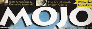
This magazine title is written in a young sort of trendy font which appeals to a younger audience. The word mojo has a meaning of being a charm or spell. This represents a young audience as it is the young who believe in fantasies and spells and charms. The spacing of the letters is also of such that the reader when reading the title would sound out each letter, reading it carefully. This allows the reader to remember the magazine more easily. The colour white represents purity and good which represents the maybe the type of music the magazine is based on. White could represent not only the young but other types of people as well which shows that although there main focus may be on the young there are also a wide range of other people the magazine invites. The letters are quite large as well which again allows the audience to recognise the title from far away.
Subscribe to:
Posts (Atom)